My Blog
Getting into the groove of this ground October 18, 2020 21:57

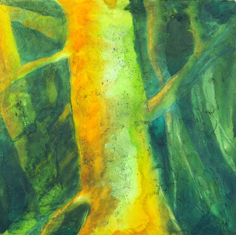
I'm starting to find my way with these grounds. This is a work in progress on the Daniel Smith Watercolor Ground, which I applied to two 16 x 20" Fredrix Pro Dixie canvases. I have no title for this one yet, although I'll probably finish it tomorrow. This is Dr. Ph. Martin Payne's Grey, cobalt teal, DS Iridescent Gold, and titanium.
I love how this stuff paints. I have been doing a lot of lifting in order to create the light areas and then highlighting what I want with Guerra's titanium pigment dispersion plus either Cheap Joe's gum arabic solution or QoR's watercolor medium. Lifting and then adding white is allowing me to do all sorts of stuff with glow and light. I've focused on that before, but I never realized how helpful lifting could be along those lines. I think I will extend the central part that's extending from the main shape and then do something with the top of the shape along the right-hand side. Not sure yet. This one is taking me quite a while to do.
I guess you can tell I am really liking working with darks. :) Have a lot more dark paintings planned. The other night I lay in bed and had a ton of ideas along those lines.
A nifty discovery October 2, 2020 18:41
I recently tried some Light Dimensional Ground from QoR. I prepared two 12 x 12" canvases with it. I made one canvas very textured and the other much less so. The highly textured canvas was a problem when it came to finishing it with cold wax; the buffing tore off a couple of sharp points of texture. But I think the less textured canvas will be a success. There's only one bit that might be too sharp, and I will sand that down if necessary. Or just cut it off.
The texture, though, is gorgeous, IMO, so even though too much texture can be a problem in itself, I really want to find a way to work with it. Because look at this--> This is as good as texture I could get with impasto oil paint or acrylic, but no waiting several days for it to dry, no smells, and watercolor is easy cleanup.
It does act differently than paper. It's very prone to lifting, which I am trying to work with instead of resisting it. And so far I have not seen it run the way some pigments do on paper with misting. That's something I will try on the next painting to see what happens.
Because of the easy lifting, it can be difficult to glaze, but glazing with dry brush is a cinch. You can see that I've used it with the light metallic paint here. What's really nice is getting the pigment caught in all the creases--just magical! And it feels a lot like happy accident time like when doing wet in wet.
So I was all gung ho about this ground, having decided I could work around the excess texture issue, but there was also its price. A 4 oz jar is $11 + shipping and I used up 2/3s of it on those two small canvases. So I wrote to QoR and asked them if they were going to make larger sizes of the Light Dimensional Ground available.

They said that was especially marketed to watercolorists, but they had the same thing by another name: Golden's Light Molding Paste. And that comes in a 32 oz jar for $28. Heck, it comes in a bucket. Hell yeah!
I have plenty of supports lying around that I can apply this stuff to, ranging from 5 x 7" to 40 x 40" canvases and panels and boards. This stuff is so nice to spread with a palette knife too (finally I have a use for them other than mixing paint)--very sensual, like cake frosting. It is so nice not to have to worry about cutting paper to the right size to fit a standard frame and to produce works that can even hang as is, with not only no need for glazing but no need for a frame at all, if people want it (although I personally like a frame and feel like it does its job of protecting especially the corners of a support).
So I've got a ton of this stuff now and am really looking forward to learning to work with it.
Light Dimensional Ground on Canvas September 19, 2020 12:34

I got some of QoR's Light Dimensional Ground and applied it to a couple of 12 x 12" canvases I had sitting around. The stuff was easy to spread with a big palette knife, but I used up 2/3s of the little jar on two canvases. I don't know if I just used too much or what. I like oil paintings with a lot of texture, and I thought I might be able to capture that effect with this stuff, so I went to town. You can see the amount of texture I ended up with.
This stuff is not as smelly as the regular watercolor ground, but I still let it dry out in the hall during the day, and since we have hooligans coming into our building at night to fuck around, I took the canvases in and put them in my window to complete drying overnight. As long as it doesn't rain or freeze, I think that's going to be a good place to let stuff dry.

Today I could hardly wait to try out these supports. One technique I use a lot in watercolor is apply some paint and then mist with a hair mister to get it to run and to encourage particles of pigment to settle in the texture of the paper. I find a hair mister works many times better than a regular sprayer. You can do tiny puffs of mist just where you want them or quickly mist the whole thing to encourage granulation. I was hoping that I could do that with this ground, but I wasn't sure, since I kept reading about how it was spongy. A spongy surface might just sop up the pigment and not allow it to run. In fact, at least one review said that.
But that's not what happened with my paint. I used Daniel Smith's Green Apatite, Winsor Newtown's Prussian Blue, Daniel Smith's New Gamboge, and Winsor Orange. The apatite settled out a dark purplish brown color different from the green that dominates it. It fell into a lot of the creases and rumples and showed up as wonderful specks. It doesn't photograph well, but the photo above shows a detail.
Here's the whole painting. When you get close to the support, it does have the look of grainy paper, but the texture reminds me of acrylic, like modeling paste. The paint isn't shiny in any way. It's completely matte. I didn't feel much of a difference between this and painting on CP except that it lifts much more easily. I tried using that to my advantage to create limbs and trees in the background, but they ended up being overworked. I also tried some highlights that way, but it looked like too-vigorous lifting. So I think I might try lifting and then painting another color over the lift area, like zinc.
I'm not sure if I will add more to this. It might look better with some blue added, especially my beloved cobalt, but OTOH, I'm eager to go ahead and seal it with cold wax and see what happens. I asked the manufacturer if they thought it would be okay to use cold wax on this, because of the spongy thing. They said they didn't know but sounded kind of doubtful. That might be because no one has tried it yet.
This stuff has a lot of possibilities, but I am not sure how much I am going to use it because it is pretty expensive in terms of how far it goes. They produce it only in a small 4 oz jar. :( However, it might be possible to use Golden's molding paste and then either use watercolor on it or spread some of the regular watercolor ground over it.
However, I did just order some of Golden's Crackle Paste to try for texture as well. I didn't realize it could be used with watercolor, but on a hunch, I thought if light dimensional ground could be used that way, so might crackle paste. I can hardly wait to get my hands on it.
I am sensitive to acrylic, but I did okay with these grounds and I don't anticipate hovering over the stuff like I used to do with my paints. I will also allow the supports to dry out in the hall and/or in the window, so I think I will be okay.
I know some people might say, "Why are you trying to get texture with watercolor?" I know it's not "traditional," although in the 19th century, British watercolorists used aquapasto in their watercolors, which can produce low dimensionality with watercolors and is made from gum arabic and silica gel (that is treated in a way that makes it safe). I've used that in the past. It can give you brushstrokes similar to a not-too-heavy Impressionist style. I still need to play with that more.
But as for why insert texture into a watercolor painting, why not? There is no reason why oils and acrylics should get to have all the fun. Texture really expands watercolor and doesn't change its fundamental nature.
Lots of possibilities!
Experimenting with different grounds September 17, 2020 14:48

I felt a bit stuck with that semi-landscape painting on watercolor ground on canvas. I couldn't get anywhere with it as a landscape and thought maybe it was because starting it as a landscape had been my entry into the box canyon. So I changed it up a lot, trying to push it into something abstract, but still felt like I was getting nowhere. And I thought it was just plain ugly. Bleh.
I think part of the reason was that I just didn't feel well. Had some kind of non-COVID thing for weeks. Plus I have thalassemia, a genetic blood disease, and its accompanying anemia can cause depression and anxiety. I sure was being hit with that. And I can't paint when I'm really down. Wish I could! Instead, I just get kind of paralyzed.

I started up a different painting on another canvas I'd prepared with watercolor ground, but I ended up being stuck in that one as well. So I chose to mess around with some Ampersand Clayboard that I forgot I had bought to experiment with egg tempera (which I once again had learned I do not have the patience for). I found them sitting in the bottom of one of my oil painting supply carts, so I took one out and painted way too many layers of watercolor on it. These are just little 6 x 6" panels, but I did learn that yep, they are totally usable for watercolor as long as you like lifting--that is, removing paint with a wet brush. I actually have been using that as a technique after being frustrated by it for years. I always preferred to glaze, which lifting interferes with, being kind of the anti-glaze. But then when I began using dark paint and white (often not allowed by traditionalists) in watercolor, I began to see how useful lifting can be. I still have a lot to learn along those lines. This is just an experimental mess. Up in the right-hand corner, you can see where I put on so much paint that I ended up with "bronzing," as it is called--a sort of sheen that some watercolor pigments take on when you use them too thick. OTOH, you could think of it as a feature instead of a bug if you had done it on purpose. But I hadn't. However, perhaps next time...

Then I went back to the second one I'd started to see if I could pull it out of the ditch. That was this. I had tentatively named it "Arrival of the Spirits." When I give a painting a title, that usually means that I see possibilities in it--that it might actually turn into a finished painting--although it's not infrequent that I give a work in progress a title only to abandon it and usually paint over it. I am thrifty about my supports. It's only when I can't manage to re-use a support that I just throw it out.
But this wip just kept sitting on my easel not doing anything because I couldn't figure out where to go with it. I like to use contrast in my paintings, and I had been working on that in this one. But there were so many things wrong with it. For one, I had tried to incorporate a blue iridescence that was too green. Etc.
So it sat.

I finally did get back to it yesterday and decided to try some drybrush on it. I first started using that when I was working mostly in casein. You dip the ends of your brush in the paint and then squeeze most of it out--in fact, it feels like you squeeze all of it out, but it turns out there is still a lot left. Then blot it on a towel. Then you kind of sweep the brush on the painting, back and forth like a cartoon house painter. It gets drier and drier but keeps on placing pigment for a long time, and even then, you can still kind of shape what's been laid down. I really like this technique. It's great for adding all sorts of shadowy depth or layers of color to a section but also good for making glow. I mixed a primary yellow with some titanium and ended up with this.
I think it's moving toward something I will finish now. Still needs more contrast and some shaping of the light parts, but it's getting there.
Back to work September 11, 2020 16:32
I've been trying to consolidate all of the different things I do, from art to teaching classes in magic to growing plants to writing books. So I'm going to be posting here again instead of on Wordpress. Trying to keep everything closer to home and decrease the craziness.
 In terms of painting, I finally started exploring the watercolor ground I've had for the past couple of years. I applied some QoR Cold Press watercolor ground to a couple of small canvases I got from Blick to do oil experiments with. That was a year ago, and I didn't accomplish much with those experiments, but I found the unused canvases when I moved and sorted all my supports out so everything is in one place and I can find stuff.
I haven't been using my oils since I moved out of my studio back in I think it was November. It was just not an okay place for a studio. Maybe great for a sawmill, due to the noise, dust, flooding, and old lead paint falling out of the ceiling, but not for a painter. But once I was out of there, I didn't feel okay about using oils in my loft. It wasn't that I was using any solvents or other toxic stuff; I use just walnut oil with an occasional foray into walnut oil + alkyd. But the smell of oxidizing vegetable oil is not that pleasant and also I have cats. And cat hair and oil paints don't mix.
So I've been using my watercolors instead, and honestly although I do miss oils and want to get back to them eventually (I would like to move to a 1-2 BR apartment in a more convenient location in spring), I am really enjoying the challenge of watercolors. I forgot how much I love Daniel Smith's Primatek Colors (made out of rocks!) and all sorts of granulating pigments.
But I've also been missing the easy framing of an oil painting. For instance, my loft is plastered with many of my oil (and acrylic paintings), which can be hung without framing--just throw a wire on the back. I haven't even varnished most of them.
But watercolors are another story. NONE of them are hanging on the walls because of the cost of framing them and because, frankly, I don't like framing behind glass. It is heavy and expensive and just aesthetically not the best, IMO.
So I've explored ways to seal watercolor paintings. One of them is just to spray them with acrylic + mineral spirits spray varnish. It works great but holy hell does it STINK. You HAVE to do it outside, even in the depths of winter, and it is, just as it smells, carcinogenic. No thank you cancer.
So instead, what I've been doing on and off with the watercolors is sealing them with Dorland's Cold Wax. This gives the colors a depth and richness plus protects the work from water. I use three coats, letting it dry thoroughly between each coat and then buffing with a soft cloth. It makes a nice satin sheen, really wonderful and not at all plasticky, like the spray varnishes can be. I have seen videos of people applying it with their fingers, but it does contain odorless mineral spirits (almost no smell), so I would not get this on my skin. I use a soft rag or a shop cloth to apply it. You can actually splash water on the thing when you are done and it will just bead up. You can pop your work into a regular frame with a foam backing and you are good to go.
However, this does mean that some competitions will not allow you to enter your work as a watercolor. Instead, you enter it as "mixed media." That is fine with me. I have found that collectors do not seem to give a damn about medium. :) And if one or two watercolor societies don't allow it, well, I don't need to be part of that.
I still felt a bit weird about framing a piece on paper and I know that many people like to get a painting all ready to hang and furthermore, they just don't like works on paper. To many, if it ain't on a canvas, it ain't art. So I decided I would try the watercolor ground on canvas.
It is fabulous. I am still experimenting with it, in particular in terms of achieving some kind of granulation. But it is fab for lifting. I do think it sucks up paint. But so far I have only tried the QoR watercolor ground and not all the other brands and types.
I was concerned because in the past I had tried it and the cold wax seemed to make any use of titanium a bit dingy. But now that does not seem to be an issue. Also, I have tried going over the titanium with a thin layer of zinc and I don't see any dingyness.
I've got tons of canvases and panels from my oil and acrylic painting days, and I am going to cover them all with watercolor ground.
Next up, using the cold wax to finish these things.
I did contact QoR to ask them about whether they thought cold wax would work on their light dimensional ground, which is some cool stuff. It looks like it has really unusual capabilities with respect to watercolor. I can hardly wait to experiment with that. But they seemed a bit doubtful that cold wax would work with that particular ground, because it is a bit spongy, but I am looking forward to giving it a try.
That said, you can do quite a bit of texture with the watercolor ground, as you can see from this photo of something I was messing around with.
And of course, once you are done painting, you can seal the paintings on watercolor ground other than the light weight stuff with cold wax, and you have a painting that is ready to hang. I love it!