My Blog
Tache, Color, and Darkness November 3, 2024 15:49 2 Comments

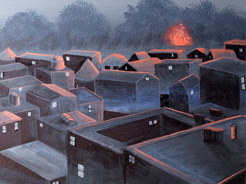
I've been working on this traditional landscape, still in progress. I started out using a very watercolor type painting style, brushing across the support, not really being that opaque, and I was mixing watercolor paints like WN French Ultramarine with WN Permanent Yellow Deep Gouache. It didn't work. I had to redo it. I'm having to retrain myself to not use watercolor painting techniques with gouache.
I admire the flat, “poster” style of some gouache painting, but I don't want to do it myself. I want a little texture. At the same time, I don't really want to learn how to paint using gouache with a palette knife or even very thick paint that shows the brush bristles. I had thought that I did having seen R.K. Blades's gouache paintings where he uses texture and (I think) a palette knife or at least a boar bristle brush. But I want the paint to be more manipulable than that.
I decided to redo the background I had of this work, keeping in mind using gouache's qualities. Since it's not oil, I can't just paint over it like it's dry oil paint. I have to approach it with a soft touch if I'm covering a lot. One way to do that is to use tache. I'm not using it much like 19th-century artists did, for “optical mixing”--putting different colors close to each other counting on the human eye to mix them. I have never thought that kind of mixing actually works. The dots of different paint always stand out to me. But tapping the brush on the support can give a really nice variety of color due to the different thicknesses of paint, even if it's opaque. I think you can see that here, especially in the upper 2/3s of the painting.

I knew I could use a deerfoot brush to do that—I have regularly used my deerfoot brush to make leafy trees in watercolor (the deerfoot is the lower of these two; the other one is a blender). And then I can go ahead and scrub over them without having to worry about wrecking the lower level of paint. That's what I did with this. And I think that is working.
The other oil technique I can use with gouache is glazing/scumbling. I already knew that from other water-media paintings I've done where I've used scumbling, like drybrush watercolor. You use a dry brush and paint that's pretty thick on the tips of the brush hairs, paint that's a little thicker than heavy cream, and scrub. Then you can get a nice scumble layer, and it looks really good. It's kind of almost a hammered look, or like those small clouds one sometimes sees high in the sky, little cushions of cirrus clouds.
I do feel like I have a lot to learn about using gouache the way I want to instead of just trying to make it do what watercolor does. It can't do that. Or if I try to make it do that, it won't look as good as it would if it was watercolor. That would be just ignoring the inherent property of gouache—its opacity.
And I also want to work harder on having intense colors as opposed to the kind of gloomy colors I've been using. I like gloomy, but I think my paintings are not gloomy enough. They are too half-assed in terms of color. The one painting I did of the city with the sun coming up,

that was gloomy enough, but it could still be more gloomy than that. But with a lot of others, it's more like the colors are kind of tepid. They're not gloomy enough. So my paintings either need to be much darker, like the guy who painted those tree paintings where you just barely see the trees, it's night, or figures are just silhouettes.
The other side of that is using more intense color. I use lamps that are pretty bright so that I can see when painting small details. But that means the paint looks much brighter than it is in normal room light. And I end up with paintings that are limp in terms of color. I want to ramp up my color, make it richer and brighter.
So a couple of things I need to work on are continuing to explore tache as a painting technique and experimenting with more intense colors or much, much darker ones.
Light Dimensional Ground on Canvas September 19, 2020 12:34

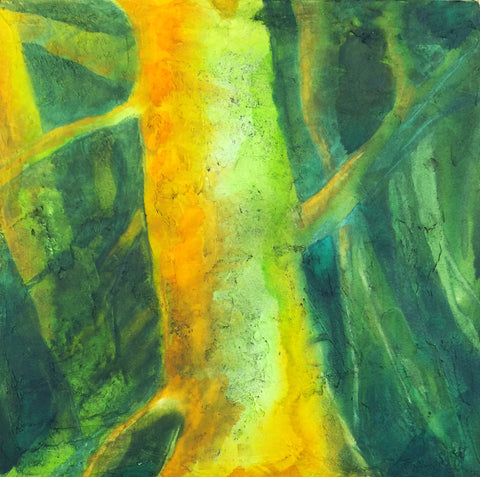
I got some of QoR's Light Dimensional Ground and applied it to a couple of 12 x 12" canvases I had sitting around. The stuff was easy to spread with a big palette knife, but I used up 2/3s of the little jar on two canvases. I don't know if I just used too much or what. I like oil paintings with a lot of texture, and I thought I might be able to capture that effect with this stuff, so I went to town. You can see the amount of texture I ended up with.
This stuff is not as smelly as the regular watercolor ground, but I still let it dry out in the hall during the day, and since we have hooligans coming into our building at night to fuck around, I took the canvases in and put them in my window to complete drying overnight. As long as it doesn't rain or freeze, I think that's going to be a good place to let stuff dry.

Today I could hardly wait to try out these supports. One technique I use a lot in watercolor is apply some paint and then mist with a hair mister to get it to run and to encourage particles of pigment to settle in the texture of the paper. I find a hair mister works many times better than a regular sprayer. You can do tiny puffs of mist just where you want them or quickly mist the whole thing to encourage granulation. I was hoping that I could do that with this ground, but I wasn't sure, since I kept reading about how it was spongy. A spongy surface might just sop up the pigment and not allow it to run. In fact, at least one review said that.
But that's not what happened with my paint. I used Daniel Smith's Green Apatite, Winsor Newtown's Prussian Blue, Daniel Smith's New Gamboge, and Winsor Orange. The apatite settled out a dark purplish brown color different from the green that dominates it. It fell into a lot of the creases and rumples and showed up as wonderful specks. It doesn't photograph well, but the photo above shows a detail.

Here's the whole painting. When you get close to the support, it does have the look of grainy paper, but the texture reminds me of acrylic, like modeling paste. The paint isn't shiny in any way. It's completely matte. I didn't feel much of a difference between this and painting on CP except that it lifts much more easily. I tried using that to my advantage to create limbs and trees in the background, but they ended up being overworked. I also tried some highlights that way, but it looked like too-vigorous lifting. So I think I might try lifting and then painting another color over the lift area, like zinc.
I'm not sure if I will add more to this. It might look better with some blue added, especially my beloved cobalt, but OTOH, I'm eager to go ahead and seal it with cold wax and see what happens. I asked the manufacturer if they thought it would be okay to use cold wax on this, because of the spongy thing. They said they didn't know but sounded kind of doubtful. That might be because no one has tried it yet.
This stuff has a lot of possibilities, but I am not sure how much I am going to use it because it is pretty expensive in terms of how far it goes. They produce it only in a small 4 oz jar. :( However, it might be possible to use Golden's molding paste and then either use watercolor on it or spread some of the regular watercolor ground over it.
However, I did just order some of Golden's Crackle Paste to try for texture as well. I didn't realize it could be used with watercolor, but on a hunch, I thought if light dimensional ground could be used that way, so might crackle paste. I can hardly wait to get my hands on it.
I am sensitive to acrylic, but I did okay with these grounds and I don't anticipate hovering over the stuff like I used to do with my paints. I will also allow the supports to dry out in the hall and/or in the window, so I think I will be okay.
I know some people might say, "Why are you trying to get texture with watercolor?" I know it's not "traditional," although in the 19th century, British watercolorists used aquapasto in their watercolors, which can produce low dimensionality with watercolors and is made from gum arabic and silica gel (that is treated in a way that makes it safe). I've used that in the past. It can give you brushstrokes similar to a not-too-heavy Impressionist style. I still need to play with that more.
But as for why insert texture into a watercolor painting, why not? There is no reason why oils and acrylics should get to have all the fun. Texture really expands watercolor and doesn't change its fundamental nature.
Lots of possibilities!
Speaking My Own Language July 24, 2017 14:14
I started my most recent painting over three times (one of the great things about painting flat with acrylic is being able to start over on the same support). First, I tried some color combinations that I've always liked but never used. I realized that they just weren't me and that I should avoid using these combos in future and instead seek out the colors *I* like to paint with.The Necessity of Changing My Style June 17, 2017 20:08 1 Comment
 There's another reason now for me to move away from incorporating so much line work in my painting. My hands are shaking. Read more...