My Blog
Tache, Color, and Darkness November 3, 2024 15:49 2 Comments

I've been working on this traditional landscape, still in progress. I started out using a very watercolor type painting style, brushing across the support, not really being that opaque, and I was mixing watercolor paints like WN French Ultramarine with WN Permanent Yellow Deep Gouache. It didn't work. I had to redo it. I'm having to retrain myself to not use watercolor painting techniques with gouache.
I admire the flat, “poster” style of some gouache painting, but I don't want to do it myself. I want a little texture. At the same time, I don't really want to learn how to paint using gouache with a palette knife or even very thick paint that shows the brush bristles. I had thought that I did having seen R.K. Blades's gouache paintings where he uses texture and (I think) a palette knife or at least a boar bristle brush. But I want the paint to be more manipulable than that.
I decided to redo the background I had of this work, keeping in mind using gouache's qualities. Since it's not oil, I can't just paint over it like it's dry oil paint. I have to approach it with a soft touch if I'm covering a lot. One way to do that is to use tache. I'm not using it much like 19th-century artists did, for “optical mixing”--putting different colors close to each other counting on the human eye to mix them. I have never thought that kind of mixing actually works. The dots of different paint always stand out to me. But tapping the brush on the support can give a really nice variety of color due to the different thicknesses of paint, even if it's opaque. I think you can see that here, especially in the upper 2/3s of the painting.

I knew I could use a deerfoot brush to do that—I have regularly used my deerfoot brush to make leafy trees in watercolor (the deerfoot is the lower of these two; the other one is a blender). And then I can go ahead and scrub over them without having to worry about wrecking the lower level of paint. That's what I did with this. And I think that is working.
The other oil technique I can use with gouache is glazing/scumbling. I already knew that from other water-media paintings I've done where I've used scumbling, like drybrush watercolor. You use a dry brush and paint that's pretty thick on the tips of the brush hairs, paint that's a little thicker than heavy cream, and scrub. Then you can get a nice scumble layer, and it looks really good. It's kind of almost a hammered look, or like those small clouds one sometimes sees high in the sky, little cushions of cirrus clouds.
I do feel like I have a lot to learn about using gouache the way I want to instead of just trying to make it do what watercolor does. It can't do that. Or if I try to make it do that, it won't look as good as it would if it was watercolor. That would be just ignoring the inherent property of gouache—its opacity.
And I also want to work harder on having intense colors as opposed to the kind of gloomy colors I've been using. I like gloomy, but I think my paintings are not gloomy enough. They are too half-assed in terms of color. The one painting I did of the city with the sun coming up,
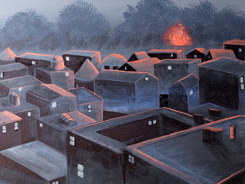
that was gloomy enough, but it could still be more gloomy than that. But with a lot of others, it's more like the colors are kind of tepid. They're not gloomy enough. So my paintings either need to be much darker, like the guy who painted those tree paintings where you just barely see the trees, it's night, or figures are just silhouettes.
The other side of that is using more intense color. I use lamps that are pretty bright so that I can see when painting small details. But that means the paint looks much brighter than it is in normal room light. And I end up with paintings that are limp in terms of color. I want to ramp up my color, make it richer and brighter.
So a couple of things I need to work on are continuing to explore tache as a painting technique and experimenting with more intense colors or much, much darker ones.
The Road to Mixed Media June 9, 2024 20:10 2 Comments
 About six months ago I decided to go ahead and experiment with using watercolors to make abstract paintings. I knew that they were not traditionally used for abstraction, but it was precisely that fact that attracted me. Watercolors didn't have the baggage that oil painting has (for me) with respect to abstraction. I did a couple of paintings back in December 2023 I was very pleased with (<--this "Lanterns of Hekate", and this --> "Roots").

I really liked how these came out. But it bothered me that they were both monochrome. I've always had problems with color use. I addressed this by using limited palettes. Some were even classical palettes, such as some listed by Tad Spurgeon's fabulous book, "The Living Craft" (which I highly recommend for painters, especially oil painters). A limited palette really helped me, and I researched which pigments were recommended for blending with other pigments, leading to many happy years of paint nerdiness--and better color composition in my paintings. I got to really enjoy, for instance, using "vibrating" colors, even just relying on pairs like blue and yellow (my favorite) to add interest to my paintings without getting lost in a candy box of all colors everywhere.
But the truth was I really liked monochrome, especially black and white. I just wondered if other people liked such paintings. Wouldn't they be considered drab or even deepressing?
Well, not everyone considered them drab or depressing. A customer bought both of these paintings less than a month after I completed them. That encouraged me to go a bit farther with monochrome paintings.

That same month I began a much larger painting than usual that I worked on for a couple of weeks. I had in the past flirted with using automatism in my painting, but this time I went whole hog, using it over the entire painting instead of in patches here and there. I started with some Daniel Smith's Lunar Black, a highly granulating paint, and just slapped it on the paper, not trying to paint anything in particular.
When the paint dried, I began picking out a subject I had only very rarely painted--an interior. I was surprised at how much I enjoyed doing that. I also brought forward a large number of small weird shapes and figures in the paint and ended up with a mostly monochrome painting with a rather dark and spooky atmosphere. The only color I added was yellow, and that was in the form of colored pencil, since I couldn't glaze over the granulated black paint without destroying the granulation. This was the first time I combined colored pencil and watercolor, and although it worked well, I felt a bit weird about it. Would I be looked down upon for this combo? Did using it mean I wasn't a "serious" artist?
I was very happy with the result, but once again I wasn't sure what people would think of it. I got plenty of positive comments on it, but no one purchased it. So I held back on the monochrome stuff.
Then something happened to me. A big part was attending an active shooter training session at my synagogue in February. My synagogue, another right over the border in MA, and the JCC in Providence all experienced bomb threats in which the caller (no, not an immigrant) informed us that since WE were killing Palestinian children, he was going to kill OUR children. They caught this guy, but he wasn't the only one. And he was far from being the only big-mouth Jew-hater in the world, and right here, where I lived.
Something in me changed forever on October 7, and that combined with the various reactions around me, of people I'd considered friends for years, and then the bomb threats and the training session (of which we will have more), made me determine that I had to find a way to deal with the darkness that was pressing in all around me and that was pulling me into despair and fury. I thought maybe monochrome, especially black and white, would be a good way to handle this emotional darkness. Let the poison out, as Fernando Botero said about his 80 paintings of men being tortured at Abu Ghraib by American forces in Iraq.

So I decided to try going with monochrome and see how it panned out. The next painting came a week after the active shooter training session. I called it "Garden Fairy," although it is the complete opposite of the usual New Age bland Tinkerbell. I have never put it up on my site, although maybe I will do it now that I feel much warmer towards it. It functioned as a kind of gate to freer painting. This began with a plan to paint an old woman in a huge sunbonnet, but rage took over as I slapped mars black paint on the paper. The image arose like a demon in a sorcerer's triangle.
I knew right away that this painting was important for me as an artist. It was ugly, but in a powerful way. It represented my own rage at the circumstances me and my people were being subjected to, but it also stood for my protective spirit. I was glad it did not incorporate any political imagery whatsoever--because I have never wanted to be a "political" artist. That is not my gig, even though I enjoy much political art. This painting was definitely monochrome, but it was also an expression of my own raw feelings, which I had basically never incorporated into my art.
I have never been an emotional painter. I have used my art to create places I would feel good about escaping into. When I got depressed, I could not paint.
So this painting of rage was seismic to my art. It united my interest in monochrome and my exploration of Surrealist automatism into an instrument of my emotions. Since then, I have continued to work in this direction and to tap into my subconscious for imagery--to allow the darkness to pour out. IMO, the paintings I have made since this one are some of the best I have ever created. I look forward to creating many more scenes of a dark world--dark, but not without hope.
Time to Experiment January 25, 2023 16:37
I promised myself that if I got into senior housing, I would take advantage of not having to work so much and instead spend more time experimenting with my art rather than trying to paint things that I think will sell. It's not that I dislike anything I've painted. If I do, it never makes it to my site. I probably throw out or paint over about 20% of what I make because it's not good enough or I just plain hate it. But it is much more difficult to take risks with art when you need sales.
But where to start?
One thing I came across that was very helpful was a video by an artist named Chelsea Lang. In this video, she talks about learning what it is that you really want to paint, that you can be passionate about consistently. To discover exactly what that is, she advises gathering images that inspire you. Once you've got a pile, you create a "curated" collection composed of images that you would be proud to have painted yourself; I've posted some of them throughout this page. You then go through the curated collection and make note of the drawing (or not, like with colorfield), the values, the color, the edges, and the composition.


Was I ever surprised what I came up with! I thought I would end up with a lot of landscapes, probably somewhat abstract or subdued. Instead, almost every single one of the 40 images I "curated" were purely abstract and many of them were even monochrome, which I never expected in a million years--get this: even though I often find myself using max 2 colors plus white & black. I marveled at this.
But I also considered it gold in terms of self-discovery.

Chelsea Lang advises that once you've got your curated collection and determined what aspects they most have in common, you have found what you should begin learning how best to paint and start practicing and studying. She also advises worrying about the mechanics of selling once you have worked that out. I think this is the most sensible advice I've heard in a really long time.
So I've begun practicing. It's the best thing I have done for my art in a long time.
Tonalism June 18, 2022 13:21
I've been painting various landscapes as a break from doing still lifes using the Flemish technique, which got on my nerves. Trying to do fine details with worn-out brushes and essential tremor is difficult. I need to be able to rest my entire arm on the support or right near it. A mahl won't work. I decided that I would have to go without the Flemish technique and instead paint these things in watercolor with a wax finish.But I needed a break. My landscapes have never called for tons of detail, and I like painting them.
I did a couple using my long canvases (12 x 36"), which sold a print or two but are too large for me to get sales with at this point. I might turn the rest into NFTs when the market comes back up. It would be a good way to use up those canvases but still make some money from them and also get to keep the originals, which I like having around. So I will try that in a bit.
Meanwhile, because my small still life (9 x 12") sold right away, I decided to try some smaller landscapes, especially after I got totally frustrated with the mandrake still life. I have about 10 11 x 14" canvases that I forgot about, so I took one of those out. I intended to add the moon to whatever landscape I made, because me and my people love us a moon.
I started with a reference photo of some trees I've often photographed behind the apartment complex. I just like them as a group. I put those in against a background from another photo of a dawn in bands of gold, pink, and blue. I put the trees in with a combo of black spinel and prussian blue. I made only a few trunks and branches, and the rest was simply blotting a worn small brush around to make leaves. They came out well.
Next up, a moon, using my plastic circles thing. I knew I would touch it up again later.
Then, a group of crows flying towards the trees, and that helped me come up with a title, "Coming Home."
It was okay but to me the colors looked pretty loud after painting with a classical palette for the still lifes. And that's when I got the idea for Tonalism. I thought I might be able to create a Tonalist work simply by adding a glaze.
Some Tonalism is a little drab and depressing to me, but other Tonalist works feature the rich colors of sunset and landscapes made mysterious by darkness or mist. So I decided to try it.

So when the painting was dry, I oiled in and tried a glaze of transparent brown oxide. That made it look really dull. Too dull. I also tried making the moon brighter at that point, but it was too difficult not to mess the glaze up--nowhere to rest my shaky hand. And since the glaze wasn't really the right color anyhow, I wiped it off.
I tried again with transparent red iron oxide. That was a lot better but still too much on the dull side. So I wiped it off too.
I dug around in my red paints, of which I have a LOT. I needed something that was on the blue side of red to make the yellow more orange, the pink more pink, and the blue somewhat purple. But the quins were way too intense, the perylenes too dull, and I have a lot of scarlets.
At the bottom of the pile was a brand new tube of ultramarine pink. I opened it to see a purplish red on the dull side, and it's transparent. So I tried a glaze of that, using a very soft brush, my siccatif de courtrai, and some extra oil.
It worked. I might put another layer on when it gets dry to intensify the colors just a bit more. If I do, I will wait until that is dry and then finally lighten the moon.
I'm pretty happy with this painting so far. It really does look like a Tonalist painting, and it was quite easy and relaxing for me to do. I will make more such paintings, using different colored glazes to get different results. Really looking forward to exploring this farther.
Fresh Horses July 29, 2021 12:59

I've been mulling my next steps in painting because of the issue with fumes from gouache burning my eyes. I started another painting with just plain watercolor, but I disliked it a great deal (<--). I could not get it to look even close to what I had imagined. I guess I would have to use oil paints to do that. I just kept looking at it and hating it, even though folks on Instagram were very supportive about it. Maybe it just looks better online than it does in person.
One problem was that I have never been able to draw a straight line. So I've got that issue throughout the painting. I decided to use painter's tape to remedy that, and it helped, but it was still an issue (I will say that Frog tape is much better than masking tape for that purpose). I bought some tools like a metal ruler (couldn't find my old metal ruler) and a ruling pen to do that, but I just didn't want to work on it anymore. They are just sitting in front of the easel.
So this morning I took the painting off the gatorbord and put the line-drawing tools away. And frankly, I was relieved. I am not cut out to be precise.
I haven't been happy with my art lately. Nothing I've been doing has been good, in my opinion, and it certainly hasn't seemed like me. I have felt very cut off from it.
Some time ago, I gave myself 10 years to become a successful painter. "Successful" for me meant that my art income would be sufficient for me to scrape by when combined with my Social Security benefits. I have not even come close with that. For the past couple of years I've made only about enough during the entire year to support myself for one single month. And that's the gross, not the net. Sheesh.
I chose ten years on account of hearing Renato Muccillo talk about how it took him that long to become a successful painter. He inspired me, even though I paint nothing like him. I like how he paints landscapes with detail but without becoming photographic. His painting is always painterly. I also like how he often uses cheap brushes. :) And I admire how productive he is. I feel like being productive is one key to becoming successful and hopefully, a good painter.
The thing is that one problem I've always had with art is that I want to do too much. I'm greedy. I want to learn how to paint everything in almost every style and in all mediums. So that results in jack of all trades, master of none syndrome. It also means my paintings have no cohesiveness as a body of work, and I feel like that should be there. I have little style of my own because I am always careening around from one thing to the next.
This is quite the contrast to how I am as a writer. I realized recently that I'm a better writer than I am an artist. Kind of a disappointing realization. Writing is work, but it's easy work for me. I never really thought about why. But I started thinking about that why. Maybe I could apply that info to my art.
It isn't just plenty of practice with expository writing that makes me a good writer. It's because when I write about something, I dig deep. I research the crap out of a topic, I read everything I can find on it, I make notes on the best info, rearrange it, write that up, and when I do that, I have gained enough knowledge and experience on whatever it is so I can come up with original ideas on the topic. So IOW, my writing is good because it's about depth, not breadth. Depth is the the environment for my writing.
I thought, how can I do that with art when I'm always all over the place? I can't. And I think that's why my art is not anywhere near as good as my writing.
So okay: concentrate on one thing. I paint three kinds of things: landscapes, abstracts, and surrealism. Which one should I concentrate on?
At first I thought landscapes. I've always loved landscapes, and I still do. George Inniss is one of my favorite painters. I've got tons of books on landscape painting, and I've already signed up for Mitchell Albala's forthcoming landscape workbook (I highly recommend his first book for landscape painters--and Suzanne Brooker's and John Carlson's). And landscapes are popular. People love them, right?
They do, but they don't love mine. I looked over the past couple of years to see what had sold. One landscape, and it was small. Most of the rest were abstracts.
I have to admit that I like painting abstracts best--better than landscapes or surreal stuff. I feel very connected to my brush when I paint them. I like that abstraction helps me dig down deep into myself and my connection with the material and spiritual worlds. Of the three focuses of my painting, abstracts feel like the most me.
And I don't have to make any straight lines if I don't want to. In fact, I usually default to curving lines and biomorphic shapes, because that's what I like to look at in life. They have a special meaning to me that I can't put into words.
Plenty of folks paint very colorful landscapes, but I have often felt constrained by local color. Conversely, with abstracts I've often painted with only two or three colors because I've been wary of jamming too many colors into one painting and losing all unity.

I want my colors to have a reason to be on the support, even if that reason is only their relationship to the other colors there. But I also want to become less wary about using them, as in this little work in progress (-->). In the past, I never would have added that pyrrole red.
So I'm going to focus on the abstract stuff for the next three years. I'm going to learn about a ton of abstract painters and go see abstract works in museums and galleries and listen to lectures about abstraction. And I'm going to paint a lot more than I have been, because for one thing, in three years I'll be 70 years old.
Time's a-wastin'.
The problem with dimensional ground, and stylization September 21, 2020 13:58
I worked on the tree painting for a while the other day, experimenting to see, for instance, how granulation would work on the lightweight dimensional ground. It worked fine. But I knew another challenge would be to see if sealing with cold wax would work on this kind of ground.
Well, it didn't. With so much texture, the wax got caught in the creases. I could have buffed that out, but rubbing the cold wax into the painting removed a couple of the tips of texture, revealing the white ground beneath. So that's out. Which is okay--the light dimensional ground is softer than the other grounds, and I can still create texture with them, just not so much. That is okay.
I've been thinking about doing landscapes again because I find them soothing but also they are another way to connect with nature. In these tumultuous times, I thought maybe people need an escape. But then I realize it might be better to think of them as respite. A peaceful, nourishing place allows for not only a rest but a renewing and regrouping of one's energies so that we can go back out there and do what needs to be done. I feel like I can justify doing landscapes for that purpose.
Yesterday I went for a walk with friends around a marsh nearby. It inspired me, and I took photos I could use for reference. I really like being able to do that with my phone instead of having to lug my DSLR around.

This morning I started on a new painting based on one of them. I had another canvas covered with the lightweight dimensional ground, but I didn't feel like using it; I wanted to use paper. So I pulled out a quarter sheet of Strathmore Gemini 500 and got to work on this, which is just the background so far.
Immediately the urge to make something Naturalist came over me, but I feel my worst landscapes have been the most Naturalist--like a really awful painting of a summer field I did some time ago. I have also resisted an urge to stylization in my landscape paintings in the past, thinking it would make them too decorative, but I'm going to go for it now and try for some more dream-like imagery through its use. I like what some other artists have done with stylization in their landscape paintings. I think it can be a good way to add some abstraction to my landscapes without going the blurry route. I like blurry landscape paintings, but I would like to try something else.
Light Dimensional Ground on Canvas September 19, 2020 12:34

I got some of QoR's Light Dimensional Ground and applied it to a couple of 12 x 12" canvases I had sitting around. The stuff was easy to spread with a big palette knife, but I used up 2/3s of the little jar on two canvases. I don't know if I just used too much or what. I like oil paintings with a lot of texture, and I thought I might be able to capture that effect with this stuff, so I went to town. You can see the amount of texture I ended up with.
This stuff is not as smelly as the regular watercolor ground, but I still let it dry out in the hall during the day, and since we have hooligans coming into our building at night to fuck around, I took the canvases in and put them in my window to complete drying overnight. As long as it doesn't rain or freeze, I think that's going to be a good place to let stuff dry.

Today I could hardly wait to try out these supports. One technique I use a lot in watercolor is apply some paint and then mist with a hair mister to get it to run and to encourage particles of pigment to settle in the texture of the paper. I find a hair mister works many times better than a regular sprayer. You can do tiny puffs of mist just where you want them or quickly mist the whole thing to encourage granulation. I was hoping that I could do that with this ground, but I wasn't sure, since I kept reading about how it was spongy. A spongy surface might just sop up the pigment and not allow it to run. In fact, at least one review said that.
But that's not what happened with my paint. I used Daniel Smith's Green Apatite, Winsor Newtown's Prussian Blue, Daniel Smith's New Gamboge, and Winsor Orange. The apatite settled out a dark purplish brown color different from the green that dominates it. It fell into a lot of the creases and rumples and showed up as wonderful specks. It doesn't photograph well, but the photo above shows a detail.
Here's the whole painting. When you get close to the support, it does have the look of grainy paper, but the texture reminds me of acrylic, like modeling paste. The paint isn't shiny in any way. It's completely matte. I didn't feel much of a difference between this and painting on CP except that it lifts much more easily. I tried using that to my advantage to create limbs and trees in the background, but they ended up being overworked. I also tried some highlights that way, but it looked like too-vigorous lifting. So I think I might try lifting and then painting another color over the lift area, like zinc.
I'm not sure if I will add more to this. It might look better with some blue added, especially my beloved cobalt, but OTOH, I'm eager to go ahead and seal it with cold wax and see what happens. I asked the manufacturer if they thought it would be okay to use cold wax on this, because of the spongy thing. They said they didn't know but sounded kind of doubtful. That might be because no one has tried it yet.
This stuff has a lot of possibilities, but I am not sure how much I am going to use it because it is pretty expensive in terms of how far it goes. They produce it only in a small 4 oz jar. :( However, it might be possible to use Golden's molding paste and then either use watercolor on it or spread some of the regular watercolor ground over it.
However, I did just order some of Golden's Crackle Paste to try for texture as well. I didn't realize it could be used with watercolor, but on a hunch, I thought if light dimensional ground could be used that way, so might crackle paste. I can hardly wait to get my hands on it.
I am sensitive to acrylic, but I did okay with these grounds and I don't anticipate hovering over the stuff like I used to do with my paints. I will also allow the supports to dry out in the hall and/or in the window, so I think I will be okay.
I know some people might say, "Why are you trying to get texture with watercolor?" I know it's not "traditional," although in the 19th century, British watercolorists used aquapasto in their watercolors, which can produce low dimensionality with watercolors and is made from gum arabic and silica gel (that is treated in a way that makes it safe). I've used that in the past. It can give you brushstrokes similar to a not-too-heavy Impressionist style. I still need to play with that more.
But as for why insert texture into a watercolor painting, why not? There is no reason why oils and acrylics should get to have all the fun. Texture really expands watercolor and doesn't change its fundamental nature.
Lots of possibilities!
Speaking My Own Language July 24, 2017 14:14
I started my most recent painting over three times (one of the great things about painting flat with acrylic is being able to start over on the same support). First, I tried some color combinations that I've always liked but never used. I realized that they just weren't me and that I should avoid using these combos in future and instead seek out the colors *I* like to paint with.Rose Moon and Vibrating Color June 3, 2017 08:18
 In Spirit of Rose Moon, I let myself play with color a lot more. I worked hard with many layers of glazing to get a good gradation in the sky area of pale yellow to pink to blue. My efforts paid off, I think. Read more...
__________________________________________________