My Blog
Time to Experiment January 25, 2023 16:37
I promised myself that if I got into senior housing, I would take advantage of not having to work so much and instead spend more time experimenting with my art rather than trying to paint things that I think will sell. It's not that I dislike anything I've painted. If I do, it never makes it to my site. I probably throw out or paint over about 20% of what I make because it's not good enough or I just plain hate it. But it is much more difficult to take risks with art when you need sales.
But where to start?
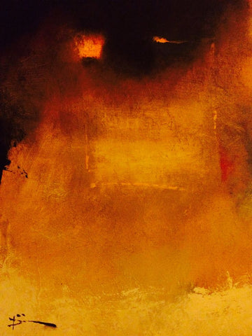
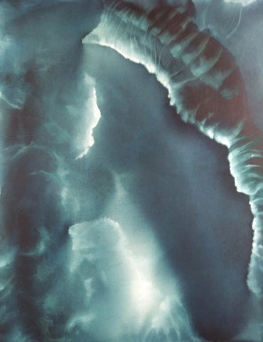
One thing I came across that was very helpful was a video by an artist named Chelsea Lang. In this video, she talks about learning what it is that you really want to paint, that you can be passionate about consistently. To discover exactly what that is, she advises gathering images that inspire you. Once you've got a pile, you create a "curated" collection composed of images that you would be proud to have painted yourself; I've posted some of them throughout this page. You then go through the curated collection and make note of the drawing (or not, like with colorfield), the values, the color, the edges, and the composition.


Was I ever surprised what I came up with! I thought I would end up with a lot of landscapes, probably somewhat abstract or subdued. Instead, almost every single one of the 40 images I "curated" were purely abstract and many of them were even monochrome, which I never expected in a million years--get this: even though I often find myself using max 2 colors plus white & black. I marveled at this.
But I also considered it gold in terms of self-discovery.

Chelsea Lang advises that once you've got your curated collection and determined what aspects they most have in common, you have found what you should begin learning how best to paint and start practicing and studying. She also advises worrying about the mechanics of selling once you have worked that out. I think this is the most sensible advice I've heard in a really long time.
So I've begun practicing. It's the best thing I have done for my art in a long time.
Fresh Horses July 29, 2021 12:59

I've been mulling my next steps in painting because of the issue with fumes from gouache burning my eyes. I started another painting with just plain watercolor, but I disliked it a great deal (<--). I could not get it to look even close to what I had imagined. I guess I would have to use oil paints to do that. I just kept looking at it and hating it, even though folks on Instagram were very supportive about it. Maybe it just looks better online than it does in person.
One problem was that I have never been able to draw a straight line. So I've got that issue throughout the painting. I decided to use painter's tape to remedy that, and it helped, but it was still an issue (I will say that Frog tape is much better than masking tape for that purpose). I bought some tools like a metal ruler (couldn't find my old metal ruler) and a ruling pen to do that, but I just didn't want to work on it anymore. They are just sitting in front of the easel.
So this morning I took the painting off the gatorbord and put the line-drawing tools away. And frankly, I was relieved. I am not cut out to be precise.
I haven't been happy with my art lately. Nothing I've been doing has been good, in my opinion, and it certainly hasn't seemed like me. I have felt very cut off from it.
Some time ago, I gave myself 10 years to become a successful painter. "Successful" for me meant that my art income would be sufficient for me to scrape by when combined with my Social Security benefits. I have not even come close with that. For the past couple of years I've made only about enough during the entire year to support myself for one single month. And that's the gross, not the net. Sheesh.
I chose ten years on account of hearing Renato Muccillo talk about how it took him that long to become a successful painter. He inspired me, even though I paint nothing like him. I like how he paints landscapes with detail but without becoming photographic. His painting is always painterly. I also like how he often uses cheap brushes. :) And I admire how productive he is. I feel like being productive is one key to becoming successful and hopefully, a good painter.
The thing is that one problem I've always had with art is that I want to do too much. I'm greedy. I want to learn how to paint everything in almost every style and in all mediums. So that results in jack of all trades, master of none syndrome. It also means my paintings have no cohesiveness as a body of work, and I feel like that should be there. I have little style of my own because I am always careening around from one thing to the next.
This is quite the contrast to how I am as a writer. I realized recently that I'm a better writer than I am an artist. Kind of a disappointing realization. Writing is work, but it's easy work for me. I never really thought about why. But I started thinking about that why. Maybe I could apply that info to my art.
It isn't just plenty of practice with expository writing that makes me a good writer. It's because when I write about something, I dig deep. I research the crap out of a topic, I read everything I can find on it, I make notes on the best info, rearrange it, write that up, and when I do that, I have gained enough knowledge and experience on whatever it is so I can come up with original ideas on the topic. So IOW, my writing is good because it's about depth, not breadth. Depth is the the environment for my writing.
I thought, how can I do that with art when I'm always all over the place? I can't. And I think that's why my art is not anywhere near as good as my writing.
So okay: concentrate on one thing. I paint three kinds of things: landscapes, abstracts, and surrealism. Which one should I concentrate on?
At first I thought landscapes. I've always loved landscapes, and I still do. George Inniss is one of my favorite painters. I've got tons of books on landscape painting, and I've already signed up for Mitchell Albala's forthcoming landscape workbook (I highly recommend his first book for landscape painters--and Suzanne Brooker's and John Carlson's). And landscapes are popular. People love them, right?
They do, but they don't love mine. I looked over the past couple of years to see what had sold. One landscape, and it was small. Most of the rest were abstracts.
I have to admit that I like painting abstracts best--better than landscapes or surreal stuff. I feel very connected to my brush when I paint them. I like that abstraction helps me dig down deep into myself and my connection with the material and spiritual worlds. Of the three focuses of my painting, abstracts feel like the most me.
And I don't have to make any straight lines if I don't want to. In fact, I usually default to curving lines and biomorphic shapes, because that's what I like to look at in life. They have a special meaning to me that I can't put into words.
Plenty of folks paint very colorful landscapes, but I have often felt constrained by local color. Conversely, with abstracts I've often painted with only two or three colors because I've been wary of jamming too many colors into one painting and losing all unity.

I want my colors to have a reason to be on the support, even if that reason is only their relationship to the other colors there. But I also want to become less wary about using them, as in this little work in progress (-->). In the past, I never would have added that pyrrole red.
So I'm going to focus on the abstract stuff for the next three years. I'm going to learn about a ton of abstract painters and go see abstract works in museums and galleries and listen to lectures about abstraction. And I'm going to paint a lot more than I have been, because for one thing, in three years I'll be 70 years old.
Time's a-wastin'.
Work in Progress 03/11/21 March 11, 2021 18:21
I also got a bunch of new brushes from The Brush Guys yesterday, some of which I used today in making the lines of light but also the bright areas in this painting. I bought a bunch of different types of small brights, which is a small square brush like a flat but shorter. I find that for me brights are very handy for drybrush and for using side foward to make lines and to lift narrow areas. I actually learned about using them from oil painting, which I hope to get back to this summer. I highly recommend The Brush Guys. They have good prices and ship fast.
Getting into the groove of this ground October 18, 2020 21:57

I'm starting to find my way with these grounds. This is a work in progress on the Daniel Smith Watercolor Ground, which I applied to two 16 x 20" Fredrix Pro Dixie canvases. I have no title for this one yet, although I'll probably finish it tomorrow. This is Dr. Ph. Martin Payne's Grey, cobalt teal, DS Iridescent Gold, and titanium.
I love how this stuff paints. I have been doing a lot of lifting in order to create the light areas and then highlighting what I want with Guerra's titanium pigment dispersion plus either Cheap Joe's gum arabic solution or QoR's watercolor medium. Lifting and then adding white is allowing me to do all sorts of stuff with glow and light. I've focused on that before, but I never realized how helpful lifting could be along those lines. I think I will extend the central part that's extending from the main shape and then do something with the top of the shape along the right-hand side. Not sure yet. This one is taking me quite a while to do.
I guess you can tell I am really liking working with darks. :) Have a lot more dark paintings planned. The other night I lay in bed and had a ton of ideas along those lines.
Light dimensional ground in my work October 10, 2020 08:51

Here's the painting I finished yesterday that was painted over light dimensional ground. It worked as an experiment: I was able to apply three coats of cold wax to protect it, although I had to be careful not to let the wax build up in the creases of the painting. I did rub off two high points of the painting, because the ground is not as hard as the plain watercolor ground, but I was able to fix that easily by just painting on the exposed ground and waxing over it. So that's a win.
However, I think I chose very much the wrong approach with this painting. I put way too much detail into it for the amount of texture it has, so the texture gets lost in the detail. From now on, I will use far less detail in paintings with light dimensional ground. Instead, I will focus on large blocks of color with a few smaller ones here and there for color contrast. I think that will work much better and allow the texture to show to its best advantage.
On this particular painting, I got very much distracted by the texture and followed it too much, which meant that the design of the paint got lost. I am just not pleased with it. I realized after seeing the work in progress in jpg form that I had way more straight lines and chunks of color than is normal for me. I generally use a lot of fluid lines and organic forms instead. I feel like although I began to put them in after I saw how blocky the shapes were that they look pasted on. They don't fit well, and that's what I don't like about the painting.
Finally, I've been working with metallic watercolor paint from Daniel Smith, the Iridescent series. It doesn't show well in this photo, but the light areas are Iridescent Gold. I've been enjoying learning how to work with this stuff, but I was concerned that the cold wax at the end would dislodge the particles of the paint. I am happy to say that didn't happen. So I am going to move forward with using Copper and Silver. Just getting that link to insert here, I saw that DS actually has a bunch of other colors in the Iridescent line, and I am most definitely going to try them! I do love DS paints.
So all in all, I learned a lot from this painting.
But I'm going to take a break from the dimensional ground and go back to the regular Daniel Smith Watercolor Ground. I want to work toward creating larger abstracts, but I also want to use up my supports, so the next two canvases (a couple of nice 16 x 20" Fredrix Pro Dixie with traditional profile) I have prepared with the DS ground. This stuff does show the texture of the brush used to apply it with (although I know there are ways around that), but I like that and it does not interfere with either my design or the application of cold wax.