My Blog
Fresh Horses July 29, 2021 12:59

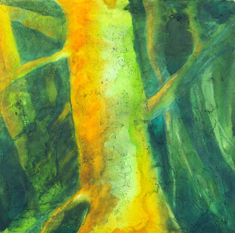
I've been mulling my next steps in painting because of the issue with fumes from gouache burning my eyes. I started another painting with just plain watercolor, but I disliked it a great deal (<--). I could not get it to look even close to what I had imagined. I guess I would have to use oil paints to do that. I just kept looking at it and hating it, even though folks on Instagram were very supportive about it. Maybe it just looks better online than it does in person.
One problem was that I have never been able to draw a straight line. So I've got that issue throughout the painting. I decided to use painter's tape to remedy that, and it helped, but it was still an issue (I will say that Frog tape is much better than masking tape for that purpose). I bought some tools like a metal ruler (couldn't find my old metal ruler) and a ruling pen to do that, but I just didn't want to work on it anymore. They are just sitting in front of the easel.
So this morning I took the painting off the gatorbord and put the line-drawing tools away. And frankly, I was relieved. I am not cut out to be precise.
I haven't been happy with my art lately. Nothing I've been doing has been good, in my opinion, and it certainly hasn't seemed like me. I have felt very cut off from it.
Some time ago, I gave myself 10 years to become a successful painter. "Successful" for me meant that my art income would be sufficient for me to scrape by when combined with my Social Security benefits. I have not even come close with that. For the past couple of years I've made only about enough during the entire year to support myself for one single month. And that's the gross, not the net. Sheesh.
I chose ten years on account of hearing Renato Muccillo talk about how it took him that long to become a successful painter. He inspired me, even though I paint nothing like him. I like how he paints landscapes with detail but without becoming photographic. His painting is always painterly. I also like how he often uses cheap brushes. :) And I admire how productive he is. I feel like being productive is one key to becoming successful and hopefully, a good painter.
The thing is that one problem I've always had with art is that I want to do too much. I'm greedy. I want to learn how to paint everything in almost every style and in all mediums. So that results in jack of all trades, master of none syndrome. It also means my paintings have no cohesiveness as a body of work, and I feel like that should be there. I have little style of my own because I am always careening around from one thing to the next.
This is quite the contrast to how I am as a writer. I realized recently that I'm a better writer than I am an artist. Kind of a disappointing realization. Writing is work, but it's easy work for me. I never really thought about why. But I started thinking about that why. Maybe I could apply that info to my art.
It isn't just plenty of practice with expository writing that makes me a good writer. It's because when I write about something, I dig deep. I research the crap out of a topic, I read everything I can find on it, I make notes on the best info, rearrange it, write that up, and when I do that, I have gained enough knowledge and experience on whatever it is so I can come up with original ideas on the topic. So IOW, my writing is good because it's about depth, not breadth. Depth is the the environment for my writing.
I thought, how can I do that with art when I'm always all over the place? I can't. And I think that's why my art is not anywhere near as good as my writing.
So okay: concentrate on one thing. I paint three kinds of things: landscapes, abstracts, and surrealism. Which one should I concentrate on?
At first I thought landscapes. I've always loved landscapes, and I still do. George Inniss is one of my favorite painters. I've got tons of books on landscape painting, and I've already signed up for Mitchell Albala's forthcoming landscape workbook (I highly recommend his first book for landscape painters--and Suzanne Brooker's and John Carlson's). And landscapes are popular. People love them, right?
They do, but they don't love mine. I looked over the past couple of years to see what had sold. One landscape, and it was small. Most of the rest were abstracts.
I have to admit that I like painting abstracts best--better than landscapes or surreal stuff. I feel very connected to my brush when I paint them. I like that abstraction helps me dig down deep into myself and my connection with the material and spiritual worlds. Of the three focuses of my painting, abstracts feel like the most me.
And I don't have to make any straight lines if I don't want to. In fact, I usually default to curving lines and biomorphic shapes, because that's what I like to look at in life. They have a special meaning to me that I can't put into words.
Plenty of folks paint very colorful landscapes, but I have often felt constrained by local color. Conversely, with abstracts I've often painted with only two or three colors because I've been wary of jamming too many colors into one painting and losing all unity.

I want my colors to have a reason to be on the support, even if that reason is only their relationship to the other colors there. But I also want to become less wary about using them, as in this little work in progress (-->). In the past, I never would have added that pyrrole red.
So I'm going to focus on the abstract stuff for the next three years. I'm going to learn about a ton of abstract painters and go see abstract works in museums and galleries and listen to lectures about abstraction. And I'm going to paint a lot more than I have been, because for one thing, in three years I'll be 70 years old.
Time's a-wastin'.
Light Dimensional Ground on Canvas September 19, 2020 12:34

I got some of QoR's Light Dimensional Ground and applied it to a couple of 12 x 12" canvases I had sitting around. The stuff was easy to spread with a big palette knife, but I used up 2/3s of the little jar on two canvases. I don't know if I just used too much or what. I like oil paintings with a lot of texture, and I thought I might be able to capture that effect with this stuff, so I went to town. You can see the amount of texture I ended up with.
This stuff is not as smelly as the regular watercolor ground, but I still let it dry out in the hall during the day, and since we have hooligans coming into our building at night to fuck around, I took the canvases in and put them in my window to complete drying overnight. As long as it doesn't rain or freeze, I think that's going to be a good place to let stuff dry.

Today I could hardly wait to try out these supports. One technique I use a lot in watercolor is apply some paint and then mist with a hair mister to get it to run and to encourage particles of pigment to settle in the texture of the paper. I find a hair mister works many times better than a regular sprayer. You can do tiny puffs of mist just where you want them or quickly mist the whole thing to encourage granulation. I was hoping that I could do that with this ground, but I wasn't sure, since I kept reading about how it was spongy. A spongy surface might just sop up the pigment and not allow it to run. In fact, at least one review said that.
But that's not what happened with my paint. I used Daniel Smith's Green Apatite, Winsor Newtown's Prussian Blue, Daniel Smith's New Gamboge, and Winsor Orange. The apatite settled out a dark purplish brown color different from the green that dominates it. It fell into a lot of the creases and rumples and showed up as wonderful specks. It doesn't photograph well, but the photo above shows a detail.
Here's the whole painting. When you get close to the support, it does have the look of grainy paper, but the texture reminds me of acrylic, like modeling paste. The paint isn't shiny in any way. It's completely matte. I didn't feel much of a difference between this and painting on CP except that it lifts much more easily. I tried using that to my advantage to create limbs and trees in the background, but they ended up being overworked. I also tried some highlights that way, but it looked like too-vigorous lifting. So I think I might try lifting and then painting another color over the lift area, like zinc.
I'm not sure if I will add more to this. It might look better with some blue added, especially my beloved cobalt, but OTOH, I'm eager to go ahead and seal it with cold wax and see what happens. I asked the manufacturer if they thought it would be okay to use cold wax on this, because of the spongy thing. They said they didn't know but sounded kind of doubtful. That might be because no one has tried it yet.
This stuff has a lot of possibilities, but I am not sure how much I am going to use it because it is pretty expensive in terms of how far it goes. They produce it only in a small 4 oz jar. :( However, it might be possible to use Golden's molding paste and then either use watercolor on it or spread some of the regular watercolor ground over it.
However, I did just order some of Golden's Crackle Paste to try for texture as well. I didn't realize it could be used with watercolor, but on a hunch, I thought if light dimensional ground could be used that way, so might crackle paste. I can hardly wait to get my hands on it.
I am sensitive to acrylic, but I did okay with these grounds and I don't anticipate hovering over the stuff like I used to do with my paints. I will also allow the supports to dry out in the hall and/or in the window, so I think I will be okay.
I know some people might say, "Why are you trying to get texture with watercolor?" I know it's not "traditional," although in the 19th century, British watercolorists used aquapasto in their watercolors, which can produce low dimensionality with watercolors and is made from gum arabic and silica gel (that is treated in a way that makes it safe). I've used that in the past. It can give you brushstrokes similar to a not-too-heavy Impressionist style. I still need to play with that more.
But as for why insert texture into a watercolor painting, why not? There is no reason why oils and acrylics should get to have all the fun. Texture really expands watercolor and doesn't change its fundamental nature.
Lots of possibilities!
Aquarius Moon is an Asshole + Finished But Not September 18, 2016 15:59
I finished that painting, which became the somewhat odd "Nymph and Her Children." This was my first real step into surrealism, if I can call it that. Since then, I have set off boldly in the surrealist direction. Read more...
_______________________________________________
Indecision: Post-Modern Vanitas vs. Spare Luminism September 11, 2016 15:16
 I have been thinking about starting a new series (well, two, actually) of paintings based on industrial buildings and having a connection to the vanitas genre. Read more...
_______________________________________________