My Blog
The Road to Mixed Media June 9, 2024 20:10 2 Comments
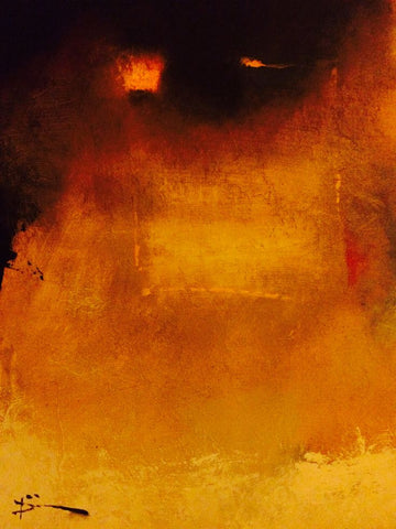
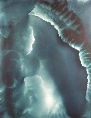
 About six months ago I decided to go ahead and experiment with using watercolors to make abstract paintings. I knew that they were not traditionally used for abstraction, but it was precisely that fact that attracted me. Watercolors didn't have the baggage that oil painting has (for me) with respect to abstraction. I did a couple of paintings back in December 2023 I was very pleased with (<--this "Lanterns of Hekate", and this --> "Roots").

I really liked how these came out. But it bothered me that they were both monochrome. I've always had problems with color use. I addressed this by using limited palettes. Some were even classical palettes, such as some listed by Tad Spurgeon's fabulous book, "The Living Craft" (which I highly recommend for painters, especially oil painters). A limited palette really helped me, and I researched which pigments were recommended for blending with other pigments, leading to many happy years of paint nerdiness--and better color composition in my paintings. I got to really enjoy, for instance, using "vibrating" colors, even just relying on pairs like blue and yellow (my favorite) to add interest to my paintings without getting lost in a candy box of all colors everywhere.
But the truth was I really liked monochrome, especially black and white. I just wondered if other people liked such paintings. Wouldn't they be considered drab or even deepressing?
Well, not everyone considered them drab or depressing. A customer bought both of these paintings less than a month after I completed them. That encouraged me to go a bit farther with monochrome paintings.

That same month I began a much larger painting than usual that I worked on for a couple of weeks. I had in the past flirted with using automatism in my painting, but this time I went whole hog, using it over the entire painting instead of in patches here and there. I started with some Daniel Smith's Lunar Black, a highly granulating paint, and just slapped it on the paper, not trying to paint anything in particular.
When the paint dried, I began picking out a subject I had only very rarely painted--an interior. I was surprised at how much I enjoyed doing that. I also brought forward a large number of small weird shapes and figures in the paint and ended up with a mostly monochrome painting with a rather dark and spooky atmosphere. The only color I added was yellow, and that was in the form of colored pencil, since I couldn't glaze over the granulated black paint without destroying the granulation. This was the first time I combined colored pencil and watercolor, and although it worked well, I felt a bit weird about it. Would I be looked down upon for this combo? Did using it mean I wasn't a "serious" artist?
I was very happy with the result, but once again I wasn't sure what people would think of it. I got plenty of positive comments on it, but no one purchased it. So I held back on the monochrome stuff.
Then something happened to me. A big part was attending an active shooter training session at my synagogue in February. My synagogue, another right over the border in MA, and the JCC in Providence all experienced bomb threats in which the caller (no, not an immigrant) informed us that since WE were killing Palestinian children, he was going to kill OUR children. They caught this guy, but he wasn't the only one. And he was far from being the only big-mouth Jew-hater in the world, and right here, where I lived.
Something in me changed forever on October 7, and that combined with the various reactions around me, of people I'd considered friends for years, and then the bomb threats and the training session (of which we will have more), made me determine that I had to find a way to deal with the darkness that was pressing in all around me and that was pulling me into despair and fury. I thought maybe monochrome, especially black and white, would be a good way to handle this emotional darkness. Let the poison out, as Fernando Botero said about his 80 paintings of men being tortured at Abu Ghraib by American forces in Iraq.

So I decided to try going with monochrome and see how it panned out. The next painting came a week after the active shooter training session. I called it "Garden Fairy," although it is the complete opposite of the usual New Age bland Tinkerbell. I have never put it up on my site, although maybe I will do it now that I feel much warmer towards it. It functioned as a kind of gate to freer painting. This began with a plan to paint an old woman in a huge sunbonnet, but rage took over as I slapped mars black paint on the paper. The image arose like a demon in a sorcerer's triangle.
I knew right away that this painting was important for me as an artist. It was ugly, but in a powerful way. It represented my own rage at the circumstances me and my people were being subjected to, but it also stood for my protective spirit. I was glad it did not incorporate any political imagery whatsoever--because I have never wanted to be a "political" artist. That is not my gig, even though I enjoy much political art. This painting was definitely monochrome, but it was also an expression of my own raw feelings, which I had basically never incorporated into my art.
I have never been an emotional painter. I have used my art to create places I would feel good about escaping into. When I got depressed, I could not paint.
So this painting of rage was seismic to my art. It united my interest in monochrome and my exploration of Surrealist automatism into an instrument of my emotions. Since then, I have continued to work in this direction and to tap into my subconscious for imagery--to allow the darkness to pour out. IMO, the paintings I have made since this one are some of the best I have ever created. I look forward to creating many more scenes of a dark world--dark, but not without hope.
Paints and Painting Mediums March 26, 2023 11:05

Recently I decided to switch to a different paint brand. I've got a ton of Williamsburg paints, but a year or so ago, I coveted a tube of Michael Harding Scarlet Lake and bought it for myself as a treat. Well, I loved it. And it was not only the color I loved, but the paint consistency--smooshy without it leaking oil all over. It was just so easy to manipulate, especially compared to the Williamsburg paints I have. They are wonderful and come in a jillion colors, but for me they are a bit stiff. I've always had to add things to them to suit me, usually some walnut oil.
Then I discovered Siccatif de Courtrai, which i've written about. This does affect the consistency slightly because it's based on (real) turpentine. Even though you add just a couple drops per blob of paint on your palette, it helps make the paint be a little more spreadable. It still wasn't enough to make it as spreadable as I would like, but a couple years ago I tried oiling in or oiling out--applying a very thin layer of oil on dry paint, then wiping it off so only a whisper of oil is left. This made it much easier for me to paint some details, although with some pigments, like prussian blue, it would make them bleed across the canvas. I had no idea how much it could extend drying time.
I still had the problem of never having a brush that was stiff enough to move the paint around but not so stiff it would leave tracks. Sheesh.
In February, I came into a little money thanks to a crypto gift, and I used $200 of it to buy a bunch of Michael Harding paints. They have completely changed how I paint.
Because yes, they are smooshy, for the most part (except the titanium), and so they really suit how I want to paint. And the colors are drenched. Gorgeous! Yes, they are more expensive than Williamsburg, but they are totally worth it for me.
At the same time, I found some brushes, quite cheap, that I like--Bristlon Silver. I never usually use rounds, but I bought some to do details. They are great for that. They keep their points but aren't so stiff that they feel like a broom. They work great with the Harding paints and I know I will get more of them. I especially want to add some filberts now, as all my filberts are in ragged shape, partly due to me cleaning them in a stupid way.
I started a new painting and after doing the drawing, I started painting without remembering to oil in first. Because of the consistency of the Harding paint, I found that I did not need to. Wow!
I also found that the paint had dried the next day. I was shocked. I checked and found that none of the pigments I had used were fast driers. I thought it might be a one-off, some kind of accident. But it wasn't. This has been the case day after day. Using just the Siccatif de Courtrai and no oiling in or added oil, the Harding paint is very spreadable in use and still dries the next day.
This is life-changing in terms of my painting. And it comes after trying a number of different mediums in an effort to get away from using the Siccatif, since it has turpentine in it and my place is tiny now and has only two windows instead of eight. I need to have the fan on and both windows open when I paint (and for hours afterward) to ensure there is no buildup of turpentine fumes. I actually like the smell of the real thing, unlike the disgusting formaldehyde-ridden crap that I've purchased from reputable art suppliers. But I know it's toxic and it does irritate my lungs. As for other solvents, no need to go there.
In terms of mediums, I tried sun-thickened poppy oil I made years ago (it's really thick now), poppy oil with driers, and heat-treated walnut oil, and none of them really improved drying time at all compared with what would be the case with the untreated oils. I really dislike the smell of oxidizing linseed oil, so I don't consider that an option in medium form, although as a binder in my paints, it doesn't bother me.
I still have a couple more mediums to try (for instance, I bought some cobalt to add to oil), but now I have the possibility of not having to use mediums at all, just paint straight from the tube. As soon as I finish this painting, I will give that a try.
Time to Experiment January 25, 2023 16:37
I promised myself that if I got into senior housing, I would take advantage of not having to work so much and instead spend more time experimenting with my art rather than trying to paint things that I think will sell. It's not that I dislike anything I've painted. If I do, it never makes it to my site. I probably throw out or paint over about 20% of what I make because it's not good enough or I just plain hate it. But it is much more difficult to take risks with art when you need sales.
But where to start?
One thing I came across that was very helpful was a video by an artist named Chelsea Lang. In this video, she talks about learning what it is that you really want to paint, that you can be passionate about consistently. To discover exactly what that is, she advises gathering images that inspire you. Once you've got a pile, you create a "curated" collection composed of images that you would be proud to have painted yourself; I've posted some of them throughout this page. You then go through the curated collection and make note of the drawing (or not, like with colorfield), the values, the color, the edges, and the composition.


Was I ever surprised what I came up with! I thought I would end up with a lot of landscapes, probably somewhat abstract or subdued. Instead, almost every single one of the 40 images I "curated" were purely abstract and many of them were even monochrome, which I never expected in a million years--get this: even though I often find myself using max 2 colors plus white & black. I marveled at this.
But I also considered it gold in terms of self-discovery.

Chelsea Lang advises that once you've got your curated collection and determined what aspects they most have in common, you have found what you should begin learning how best to paint and start practicing and studying. She also advises worrying about the mechanics of selling once you have worked that out. I think this is the most sensible advice I've heard in a really long time.
So I've begun practicing. It's the best thing I have done for my art in a long time.
Fresh Horses July 29, 2021 12:59

I've been mulling my next steps in painting because of the issue with fumes from gouache burning my eyes. I started another painting with just plain watercolor, but I disliked it a great deal (<--). I could not get it to look even close to what I had imagined. I guess I would have to use oil paints to do that. I just kept looking at it and hating it, even though folks on Instagram were very supportive about it. Maybe it just looks better online than it does in person.
One problem was that I have never been able to draw a straight line. So I've got that issue throughout the painting. I decided to use painter's tape to remedy that, and it helped, but it was still an issue (I will say that Frog tape is much better than masking tape for that purpose). I bought some tools like a metal ruler (couldn't find my old metal ruler) and a ruling pen to do that, but I just didn't want to work on it anymore. They are just sitting in front of the easel.
So this morning I took the painting off the gatorbord and put the line-drawing tools away. And frankly, I was relieved. I am not cut out to be precise.
I haven't been happy with my art lately. Nothing I've been doing has been good, in my opinion, and it certainly hasn't seemed like me. I have felt very cut off from it.
Some time ago, I gave myself 10 years to become a successful painter. "Successful" for me meant that my art income would be sufficient for me to scrape by when combined with my Social Security benefits. I have not even come close with that. For the past couple of years I've made only about enough during the entire year to support myself for one single month. And that's the gross, not the net. Sheesh.
I chose ten years on account of hearing Renato Muccillo talk about how it took him that long to become a successful painter. He inspired me, even though I paint nothing like him. I like how he paints landscapes with detail but without becoming photographic. His painting is always painterly. I also like how he often uses cheap brushes. :) And I admire how productive he is. I feel like being productive is one key to becoming successful and hopefully, a good painter.
The thing is that one problem I've always had with art is that I want to do too much. I'm greedy. I want to learn how to paint everything in almost every style and in all mediums. So that results in jack of all trades, master of none syndrome. It also means my paintings have no cohesiveness as a body of work, and I feel like that should be there. I have little style of my own because I am always careening around from one thing to the next.
This is quite the contrast to how I am as a writer. I realized recently that I'm a better writer than I am an artist. Kind of a disappointing realization. Writing is work, but it's easy work for me. I never really thought about why. But I started thinking about that why. Maybe I could apply that info to my art.
It isn't just plenty of practice with expository writing that makes me a good writer. It's because when I write about something, I dig deep. I research the crap out of a topic, I read everything I can find on it, I make notes on the best info, rearrange it, write that up, and when I do that, I have gained enough knowledge and experience on whatever it is so I can come up with original ideas on the topic. So IOW, my writing is good because it's about depth, not breadth. Depth is the the environment for my writing.
I thought, how can I do that with art when I'm always all over the place? I can't. And I think that's why my art is not anywhere near as good as my writing.
So okay: concentrate on one thing. I paint three kinds of things: landscapes, abstracts, and surrealism. Which one should I concentrate on?
At first I thought landscapes. I've always loved landscapes, and I still do. George Inniss is one of my favorite painters. I've got tons of books on landscape painting, and I've already signed up for Mitchell Albala's forthcoming landscape workbook (I highly recommend his first book for landscape painters--and Suzanne Brooker's and John Carlson's). And landscapes are popular. People love them, right?
They do, but they don't love mine. I looked over the past couple of years to see what had sold. One landscape, and it was small. Most of the rest were abstracts.
I have to admit that I like painting abstracts best--better than landscapes or surreal stuff. I feel very connected to my brush when I paint them. I like that abstraction helps me dig down deep into myself and my connection with the material and spiritual worlds. Of the three focuses of my painting, abstracts feel like the most me.
And I don't have to make any straight lines if I don't want to. In fact, I usually default to curving lines and biomorphic shapes, because that's what I like to look at in life. They have a special meaning to me that I can't put into words.
Plenty of folks paint very colorful landscapes, but I have often felt constrained by local color. Conversely, with abstracts I've often painted with only two or three colors because I've been wary of jamming too many colors into one painting and losing all unity.

I want my colors to have a reason to be on the support, even if that reason is only their relationship to the other colors there. But I also want to become less wary about using them, as in this little work in progress (-->). In the past, I never would have added that pyrrole red.
So I'm going to focus on the abstract stuff for the next three years. I'm going to learn about a ton of abstract painters and go see abstract works in museums and galleries and listen to lectures about abstraction. And I'm going to paint a lot more than I have been, because for one thing, in three years I'll be 70 years old.
Time's a-wastin'.
Work in Progress 03/11/21 March 11, 2021 18:21
I also got a bunch of new brushes from The Brush Guys yesterday, some of which I used today in making the lines of light but also the bright areas in this painting. I bought a bunch of different types of small brights, which is a small square brush like a flat but shorter. I find that for me brights are very handy for drybrush and for using side foward to make lines and to lift narrow areas. I actually learned about using them from oil painting, which I hope to get back to this summer. I highly recommend The Brush Guys. They have good prices and ship fast.
A nifty discovery October 2, 2020 18:41
I recently tried some Light Dimensional Ground from QoR. I prepared two 12 x 12" canvases with it. I made one canvas very textured and the other much less so. The highly textured canvas was a problem when it came to finishing it with cold wax; the buffing tore off a couple of sharp points of texture. But I think the less textured canvas will be a success. There's only one bit that might be too sharp, and I will sand that down if necessary. Or just cut it off.
The texture, though, is gorgeous, IMO, so even though too much texture can be a problem in itself, I really want to find a way to work with it. Because look at this--> This is as good as texture I could get with impasto oil paint or acrylic, but no waiting several days for it to dry, no smells, and watercolor is easy cleanup.
It does act differently than paper. It's very prone to lifting, which I am trying to work with instead of resisting it. And so far I have not seen it run the way some pigments do on paper with misting. That's something I will try on the next painting to see what happens.
Because of the easy lifting, it can be difficult to glaze, but glazing with dry brush is a cinch. You can see that I've used it with the light metallic paint here. What's really nice is getting the pigment caught in all the creases--just magical! And it feels a lot like happy accident time like when doing wet in wet.
So I was all gung ho about this ground, having decided I could work around the excess texture issue, but there was also its price. A 4 oz jar is $11 + shipping and I used up 2/3s of it on those two small canvases. So I wrote to QoR and asked them if they were going to make larger sizes of the Light Dimensional Ground available.

They said that was especially marketed to watercolorists, but they had the same thing by another name: Golden's Light Molding Paste. And that comes in a 32 oz jar for $28. Heck, it comes in a bucket. Hell yeah!
I have plenty of supports lying around that I can apply this stuff to, ranging from 5 x 7" to 40 x 40" canvases and panels and boards. This stuff is so nice to spread with a palette knife too (finally I have a use for them other than mixing paint)--very sensual, like cake frosting. It is so nice not to have to worry about cutting paper to the right size to fit a standard frame and to produce works that can even hang as is, with not only no need for glazing but no need for a frame at all, if people want it (although I personally like a frame and feel like it does its job of protecting especially the corners of a support).
So I've got a ton of this stuff now and am really looking forward to learning to work with it.
Experimenting with different grounds September 17, 2020 14:48

I felt a bit stuck with that semi-landscape painting on watercolor ground on canvas. I couldn't get anywhere with it as a landscape and thought maybe it was because starting it as a landscape had been my entry into the box canyon. So I changed it up a lot, trying to push it into something abstract, but still felt like I was getting nowhere. And I thought it was just plain ugly. Bleh.
I think part of the reason was that I just didn't feel well. Had some kind of non-COVID thing for weeks. Plus I have thalassemia, a genetic blood disease, and its accompanying anemia can cause depression and anxiety. I sure was being hit with that. And I can't paint when I'm really down. Wish I could! Instead, I just get kind of paralyzed.

I started up a different painting on another canvas I'd prepared with watercolor ground, but I ended up being stuck in that one as well. So I chose to mess around with some Ampersand Clayboard that I forgot I had bought to experiment with egg tempera (which I once again had learned I do not have the patience for). I found them sitting in the bottom of one of my oil painting supply carts, so I took one out and painted way too many layers of watercolor on it. These are just little 6 x 6" panels, but I did learn that yep, they are totally usable for watercolor as long as you like lifting--that is, removing paint with a wet brush. I actually have been using that as a technique after being frustrated by it for years. I always preferred to glaze, which lifting interferes with, being kind of the anti-glaze. But then when I began using dark paint and white (often not allowed by traditionalists) in watercolor, I began to see how useful lifting can be. I still have a lot to learn along those lines. This is just an experimental mess. Up in the right-hand corner, you can see where I put on so much paint that I ended up with "bronzing," as it is called--a sort of sheen that some watercolor pigments take on when you use them too thick. OTOH, you could think of it as a feature instead of a bug if you had done it on purpose. But I hadn't. However, perhaps next time...

Then I went back to the second one I'd started to see if I could pull it out of the ditch. That was this. I had tentatively named it "Arrival of the Spirits." When I give a painting a title, that usually means that I see possibilities in it--that it might actually turn into a finished painting--although it's not infrequent that I give a work in progress a title only to abandon it and usually paint over it. I am thrifty about my supports. It's only when I can't manage to re-use a support that I just throw it out.
But this wip just kept sitting on my easel not doing anything because I couldn't figure out where to go with it. I like to use contrast in my paintings, and I had been working on that in this one. But there were so many things wrong with it. For one, I had tried to incorporate a blue iridescence that was too green. Etc.
So it sat.

I finally did get back to it yesterday and decided to try some drybrush on it. I first started using that when I was working mostly in casein. You dip the ends of your brush in the paint and then squeeze most of it out--in fact, it feels like you squeeze all of it out, but it turns out there is still a lot left. Then blot it on a towel. Then you kind of sweep the brush on the painting, back and forth like a cartoon house painter. It gets drier and drier but keeps on placing pigment for a long time, and even then, you can still kind of shape what's been laid down. I really like this technique. It's great for adding all sorts of shadowy depth or layers of color to a section but also good for making glow. I mixed a primary yellow with some titanium and ended up with this.
I think it's moving toward something I will finish now. Still needs more contrast and some shaping of the light parts, but it's getting there.
Finally Here! September 6, 2016 10:01
 I moved from Elmira, NY to Pawtucket, RI on August 18/19, but it's taken me all this time just to get sort of settled in. Read more...
Politics and [My] Art July 30, 2016 19:55
 Some people believe that the combination of politics and art in general is a deadly mix, but I'm more of the school that art can never be free of politics--that even "art for art's sake" is a political statement (thank you, Russian Formalism). Read more...
_______________________________________________
Letting Images Arise: Automatism December 28, 2015 18:25 1 Comment
 I allowed the image to arise as I painted. I hoped that if I were open to a connection with the spirit world while I painted and at the same time tried to focus on a particular concept (like spirits of Mars or Water magic), that whatever came out on the paper would simply take the form most appropriate for that energy or work and for me. Read more...