My Blog
Tache, Color, and Darkness November 3, 2024 15:49 2 Comments

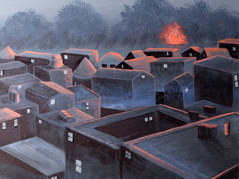
I've been working on this traditional landscape, still in progress. I started out using a very watercolor type painting style, brushing across the support, not really being that opaque, and I was mixing watercolor paints like WN French Ultramarine with WN Permanent Yellow Deep Gouache. It didn't work. I had to redo it. I'm having to retrain myself to not use watercolor painting techniques with gouache.
I admire the flat, “poster” style of some gouache painting, but I don't want to do it myself. I want a little texture. At the same time, I don't really want to learn how to paint using gouache with a palette knife or even very thick paint that shows the brush bristles. I had thought that I did having seen R.K. Blades's gouache paintings where he uses texture and (I think) a palette knife or at least a boar bristle brush. But I want the paint to be more manipulable than that.
I decided to redo the background I had of this work, keeping in mind using gouache's qualities. Since it's not oil, I can't just paint over it like it's dry oil paint. I have to approach it with a soft touch if I'm covering a lot. One way to do that is to use tache. I'm not using it much like 19th-century artists did, for “optical mixing”--putting different colors close to each other counting on the human eye to mix them. I have never thought that kind of mixing actually works. The dots of different paint always stand out to me. But tapping the brush on the support can give a really nice variety of color due to the different thicknesses of paint, even if it's opaque. I think you can see that here, especially in the upper 2/3s of the painting.

I knew I could use a deerfoot brush to do that—I have regularly used my deerfoot brush to make leafy trees in watercolor (the deerfoot is the lower of these two; the other one is a blender). And then I can go ahead and scrub over them without having to worry about wrecking the lower level of paint. That's what I did with this. And I think that is working.
The other oil technique I can use with gouache is glazing/scumbling. I already knew that from other water-media paintings I've done where I've used scumbling, like drybrush watercolor. You use a dry brush and paint that's pretty thick on the tips of the brush hairs, paint that's a little thicker than heavy cream, and scrub. Then you can get a nice scumble layer, and it looks really good. It's kind of almost a hammered look, or like those small clouds one sometimes sees high in the sky, little cushions of cirrus clouds.
I do feel like I have a lot to learn about using gouache the way I want to instead of just trying to make it do what watercolor does. It can't do that. Or if I try to make it do that, it won't look as good as it would if it was watercolor. That would be just ignoring the inherent property of gouache—its opacity.
And I also want to work harder on having intense colors as opposed to the kind of gloomy colors I've been using. I like gloomy, but I think my paintings are not gloomy enough. They are too half-assed in terms of color. The one painting I did of the city with the sun coming up,

that was gloomy enough, but it could still be more gloomy than that. But with a lot of others, it's more like the colors are kind of tepid. They're not gloomy enough. So my paintings either need to be much darker, like the guy who painted those tree paintings where you just barely see the trees, it's night, or figures are just silhouettes.
The other side of that is using more intense color. I use lamps that are pretty bright so that I can see when painting small details. But that means the paint looks much brighter than it is in normal room light. And I end up with paintings that are limp in terms of color. I want to ramp up my color, make it richer and brighter.
So a couple of things I need to work on are continuing to explore tache as a painting technique and experimenting with more intense colors or much, much darker ones.
Avoiding the trap of reference photos June 23, 2018 15:44
Some people use reference photos as a sort of sacred text for their painting. They will even project it onto their support and trace over it. For me, a reference photo can be a valuable aid for getting some interesting shapes, but if I start trying to copy the colors, it can easily turn into a trap and the resulting painting just looks dead somehow. So usually I morph my reference photos in some major way.Whistler and Lautrec April 8, 2016 20:40
 Whistler would work on a painting for hours and be all happy about it for 15 minutes, "It's GREAT!", bragging all over about it, and then an hour later he'd go and scrape it off the canvas, terrified that someone would see it and think what a crap artist he was. Read more...
_______________________________________________